Reinventing packaging without reinventing the wheel
Packaging can be a funny thing. Design something to look old, and people will appreciate the vintage look. Leave a design alone for too long, and the design doesn’t become vintage. It becomes old. That was the fear of Land O’Frost, a leading deli brand with nationwide distribution. The company was concerned that its packaging, which had been largely unchanged since the 1990s, had become outdated.
To fix things, the company didn’t throw out its existing design and start over. Its changes are more subtle than a complete overhaul. Some of the primary elements have been left alone, and the net result is a package that is more contemporary but still familiar to its consumers.
The journey toward a new packaging design began when the company started asking important questions about how well it was reaching consumers. In order to inform consumers before they went to the store, the company launched its first national advertising campaign, on television and through social media channels.
“That was a big move for Land O’Frost, to go national with advertising, which is something we had never done before. It was something we felt was the right thing to do, and we had the right consumer insights underpinning how we did it,” explains Mark Miller, Vice President of Marketing & Innovation.
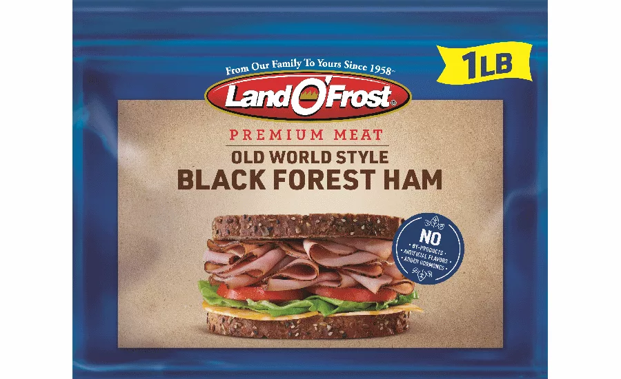
From there, the company started looking at how it informed consumers once they were in the store. Is the package that was suited to consumers in 1990 still relevant in 2020? In some instances, yes. The company’s blue border, for instance, was an easy way for consumers to quickly pick it out at the retail deli aisle. The yellow flag that showed the weight of the package indicated value. Other elements needed changing.
By doing research with deli meat consumers, Land O’Frost came to an understanding on how to proceed. “First thing they said is, ‘I like the pack, I like the structure, and I like the idea of freshness. But there’s a lot of communication going on in the front of the pack, and by the way it looks a little outdated,’” Miller explains. “The third thing they said is, ‘Can you increase the appetite appeal and draw me in a little more to ensure that I can visualize how I’m going to make a sandwich and bring it home to my family?’”
To add to the package’s eye appeal and inspiration, the company eliminated the etching that had been a prominent part of the old design. In its place, the company placed a picture of a hearty, delicious-looking sandwich, with a generous serving of ham, turkey or other meat with a variety of toppings.
“Through rigorous consumer research we were able to understand what was possible for the design,” said Richard Palmer, creative director for Little Big Brands, the design firm that worked on the packaging. “We found that clear communication of quality and visual appetite appeal were critical areas for improvement. The new design addresses both quality and taste while harkening back to the brand’s visual heritage with artisanal cues and Land O’Frost’s core equity blue color.”
Because the design has become more simplistic, the individual elements are more noticeable. The company has always included the word “Premium” on the package. It’s still there in the design update, but it’s smaller than it used to be. However, because the package is less busy, the word is actually more prominent than it used to be, even though the font size has shrunk.
The packaging was introduced at the Annual Meat Conference, held earlier this year. Miller says that the response from the company’s retail partners was very favorable.
“The prepackaged lunchmeat is a relatively flat category, maybe up .1 or .2% year over year according to Nielsen. This business is up close to 4%,” he adds. “We’re driving category growth, and we aren’t resting on our laurels. We’re ensuring we’re relevant at shelf, not only now but for the next 5 or 10 years.”
“I don’t think we’re going to wait 30 years for the next refresh!” he added.
Looking for a reprint of this article?
From high-res PDFs to custom plaques, order your copy today!


